3 interaction design things
- Author Benjy Stanton
- Date
- Categories
Get the slides
Hi, my name is Benjy
Hi, my name is Benjy and I'm an interaction designer from Swansea. I’m interested in user-centred design in the public sector, inclusive design and accessibility.
Link to slides and transcripts
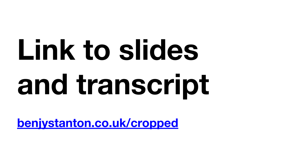
Here’s a link to my slides and a rough transcript. If you go to my blog you can download the slides for later, and get access to the links that I mention.
3 interaction design things
The focus of this talk is about 3 interaction design workflow type things that I think/hope can be applied to other design practices too.
These are things that I’m trying to get better at the moment. I can’t say that I do them consistently on every project, but I believe that they can lead to better outcomes.
Who I’ve worked with
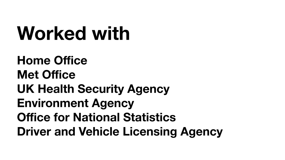
I've been working as a designer for about 20 years. And I’ve been focused on design in government for about nine years now. My first ever role was with DVLA here in Swansea, and currently I’m working remotely as a contractor for the Home Office.
I’ve worked as a civil servant, as an external designer working via a design agency and as a freelancer.
Things that I do
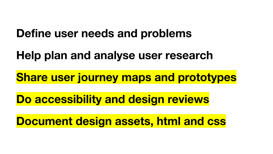
According to my website, these are the things that I do, but I want to focus more on the second half of the list today.
I think there are a lot of people who talk and write about user needs and user research better than me. Those things are essential, but I want to focus on these things…
- sharing user journey maps and prototypes
- doing accessibility and design reviews
- documenting design assets, html and css
I’m really interested in how we can execute user research findings and business requirements to make the best thing.
That can mean spending a lot of time in meetings, talking to stakeholders and alongside software developers. Just to get something over the line.
Thing 1: share early and iterate
I think that sharing early and often is a great practice. I think as an inexperienced designer, I wanted to hide my work away until I thought it was perfect. But this is rarely a good approach.
It’s much better to involve the whole team and get their expertise as early as possible.
Poppit Sands lifeguard sign
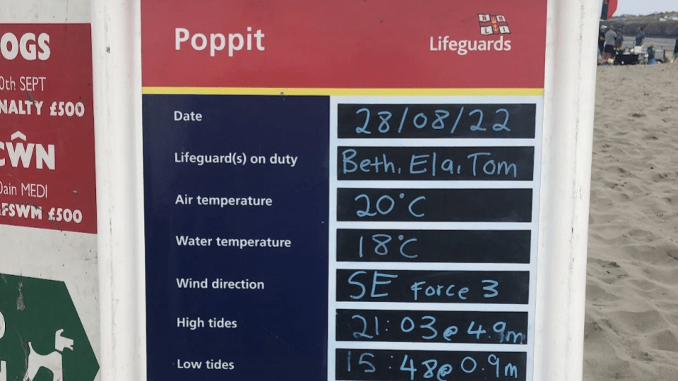
One example I want to give was when I was working with Made Tech and Met Office on improving beach safety
This photo shows a lifeguard sign on Poppet Sands beach near Cardigan.
Met Office were working with other organisations, like RNLI, to get more beach safety information into their app. Understanding information like tide times and wind strength can help stop paddle boarders, for example, from getting into trouble at sea.
Working on this team was great, everyone joined in with the design ideation sessions. Often the best ideas came from non-designers. I think as a inexperienced designer, I would have dismissed ideas that didn’t come from other designers, which is a real shame.
The boring designer
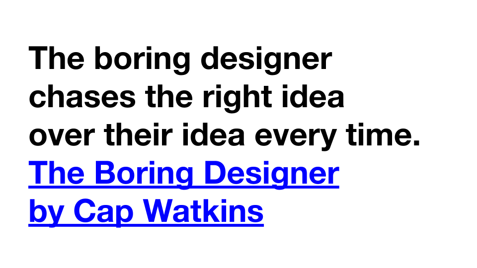
I really like this quote from Cap Watkins, from a blog post called the boring designer, and he says that…
The boring designer chases the right idea over their idea every time.
I think the skill of a designer is in the execution and testing. Part of the work is discovering all the potential ideas and whittling it down to the best one. It might come from something a user says, a team mate, or from a stakeholder.
It’s good to not be too precious over where ideas come from.
Searching for beach forecasts
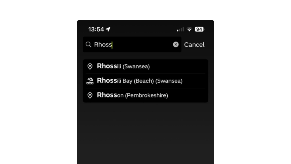
We had a problem on the app where users couldn't find the beach forecasts, alongside the normal forecasts. One of the devs on the team suggested that we change the icon in the search results to make the beach items stand out a bit.
This screenshots show how when searching for Rhossili, you get 2 results, one is Rhossili the place and the other Rhossili beach. We did some click testing, and this change improved peoples' ability to get the beach forecast.
It's just a small incremental improvement, but it's probably one I wouldn't have come up with by myself.
A prototype is worth a thousand meetings
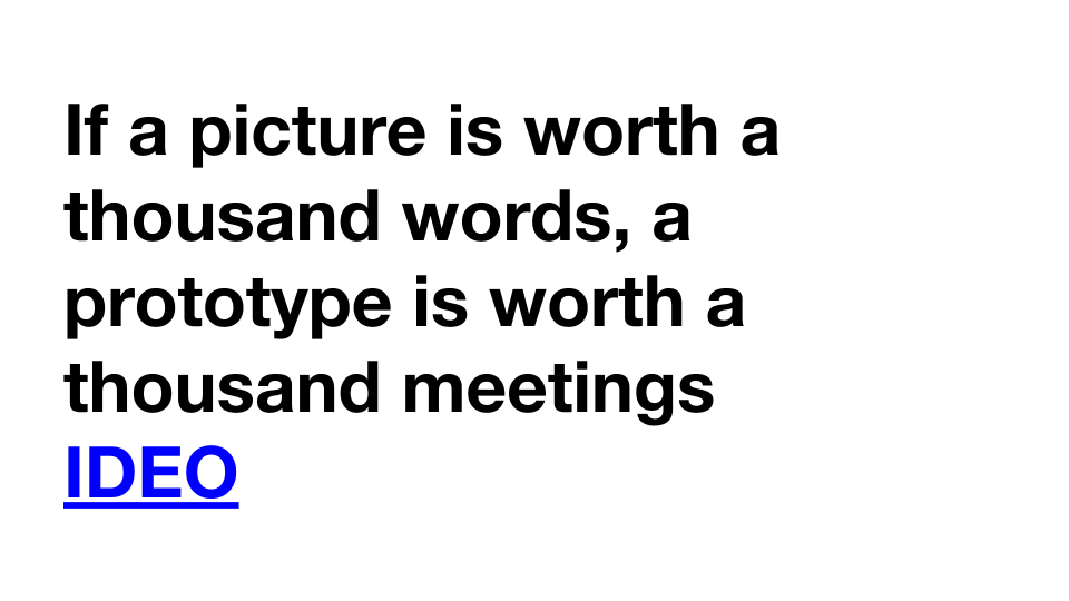
I like this quote from IDEO as well…
If a picture is worth a thousand words, a prototype is worth a thousand meetings
Jo Carter reminded me about it recently in a blog post she wrote.
It's so easy to get stuck in meetings that go round and round with no real outcome. I think something designers can do really well is to help visualise the conversations.
Perhaps everyone is discussing a complex user journey. Or changing something on a page. By visualising it using pictures and prototypes, designers can help the whole team to get a shared understanding of the decisions and ideas that are being floated.
It can also come in useful, when you need to test or revisit the idea later.
Flow diagrams
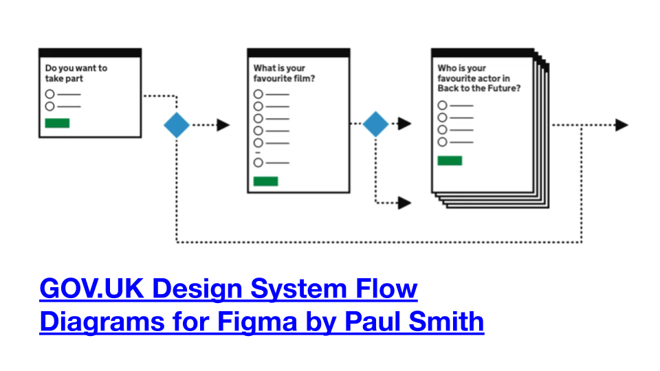
This template by Paul Smith is great for quickly putting together flow diagrams. The level of detail is just right for visualising high level journeys.
It looks enough like a website, but it stops people from getting to bogged down in discussions over the detail.
I adapted this whilst working on the Met Office mobile app. And the devs really liked it.
GOV.UK Design System Flow Diagrams for Figma
Thing 2: Make it work for everyone
Thing two is “make it work for everyone”.
People are often excluded from digital things, because the designers responsible didn’t consider the needs of everyone, and so they end up introducing barriers that can block people with disabilities from using the service.
Accessible design is good design
I strongly believe that “accessible design is good design”.
Driving with a medical condition service
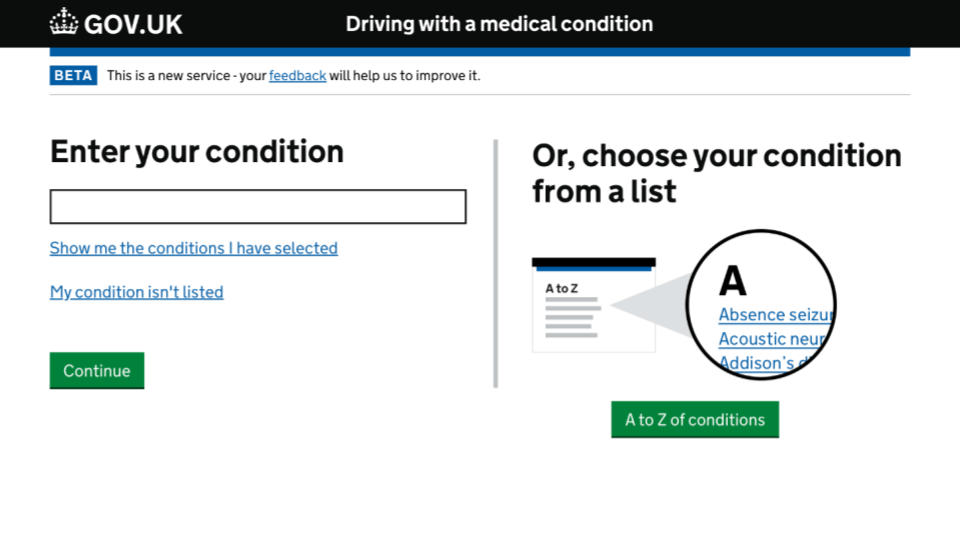
I first properly learnt about accessibility whilst I was at DVLA. I was working on a service called “driving with a medical condition”.
It’s used by people who have disabilities and long term medical conditions that affect their ability to drive. Things like epilepsy, Parkinson’s and visual impairments.
All designs should be accessible, but it was critical here since many of the conditions that may affect someone’s ability to drive might also affect their ability to use a poorly designed digital service.
Working with disability charities and user research with people with disabilities
We did loads of user research, and we worked closely with charities, to understand the barriers that these users might face when using a poorly designed digital experience.
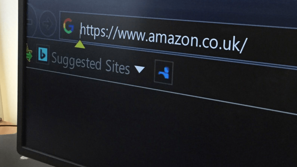
This is a photo I took whilst visiting RNIB (Royal National Institute of Blind People) in Cardiff.
I think something clicked for me when seeing this. It’s too easy to dismiss the experience of disabled people if you don’t spend time talking with them and understanding the barriers they might face.
This person has high contrast mode turned on and is zoomed right in using a screen magnifier.
It’s absolutely possible to design digital services that are compatible with computers that have been set up in this way. As long as you follow web standards, and test your work as you go.
Basic accessibility checks
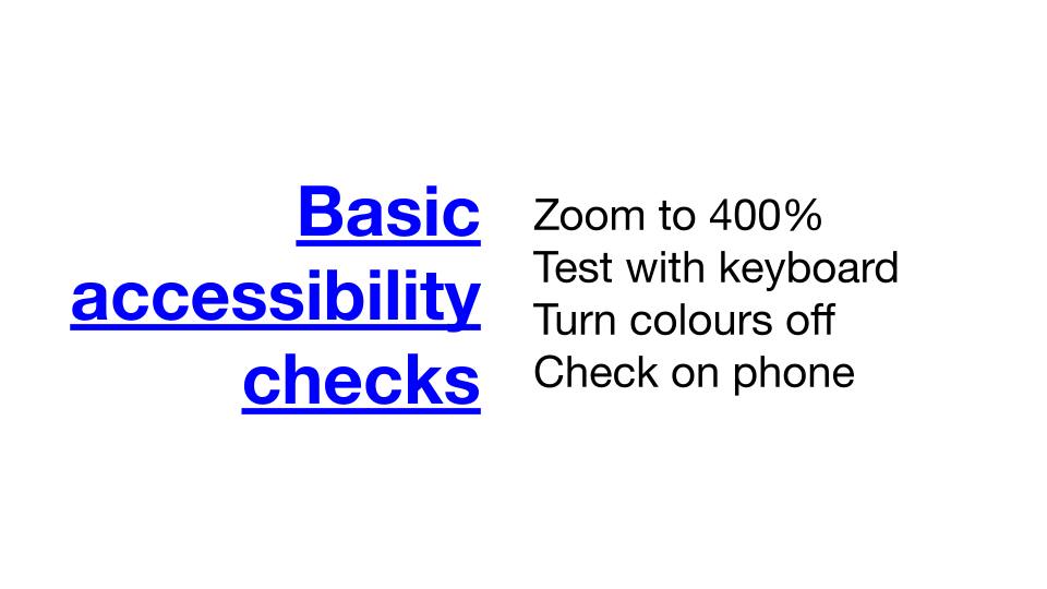
These are some basic accessibility checks I recommend doing on every design…
- zoom to 400%
- test with keyboard
- turn colours off
- check on phone
I also have a more detailed accessibility checklist with links to more resources.
Microsoft’s Accessibility Insights for Web
This is a screenshot of Microsoft’s Accessibility Insights for Web plug-in running on my homepage.
It visualises the order of interactive elements. Each time you press tab on the keyboard, it jumps to the next link or button. It's really useful for making sure the experience for keyboard users is equivalent to mouse users.
If the order is not quite right, or keyboard focus in unclear, then it's probably a sign that other assistive technology tools will struggle too.
Screenshots like this can become part of a handover document for developers too, so they can see how the code should be built.
Thing 3: document everything
That takes me to my last point which is “document everything”.
Make things open, it makes things better
One great thing about the design community in UK government is that they love designing in the open.
I think as civil servants it's really important show your workings, so that they can be accountable to the public. After all, government work is funded by taxes, so it’s important to show how it’s being spent.
Even if you can’t share your work publicly, I think that getting into a habit of documenting things will help you, your team and other teams in your organisation to learn and improve.
(Aside: if you’re interested in stickers, check out this post by Vicky Teinaki: Metaphors we sticker by)
Department for Education’s design histories
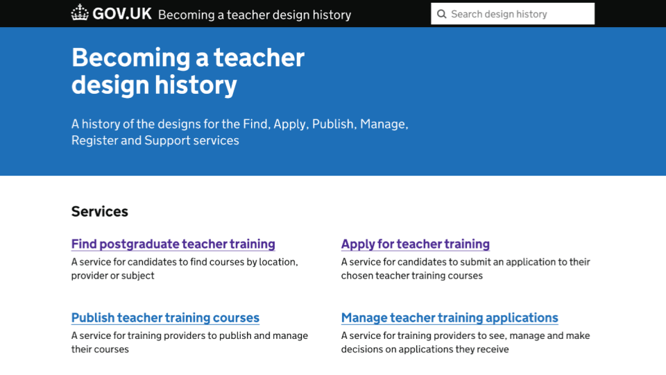
One really good example of this is design histories.
This is a community built tool from X-GOVUK.
It’s not funded by gov, it’s just a bunch of people getting together to make free tools for the community.
This screenshot shows how Department for Education (DfE) have used this tool to create really detailed design histories for their teacher services.
I recommend taking a look if you have time.
Design history tool
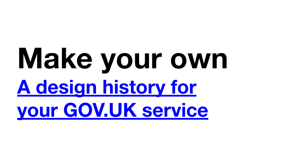
Or you can create your own if you want. As mentioned, the tool is open and free. Even if you’re not working on GOV.UK services, you’re welcome to have a poke around.
A design history for your GOV.UK service.
Basic design history questions
Even if you don’t want to create a whole website to document your decisions. I think documenting basic design histories are really worth it.
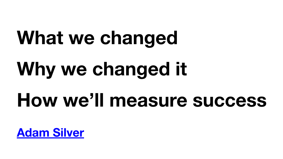
Something I'm trying to do it at the moment is answer these questions (via Adam Silver) at the end of every week.
- What we changed
- Why we changed it
- How we’ll measure success
I’ve been doing this for a few months now, and it’s really great to see how a design has evolved over time. Just a few paragraphs every week can soon become a really valuable resource.
And it can become really useful for justifying decisions, helping new team members get up to speed and avoiding past mistakes.
Recap
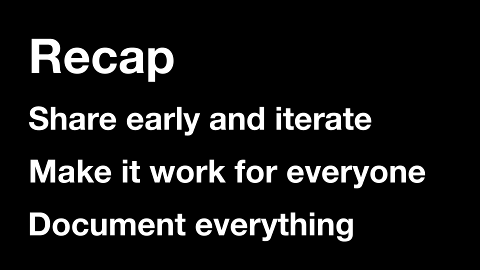
So to recap, these are the 3 things I’ve been talking about…
- Share early and iterate
- Make it work for everyone
- Document everything
Why?
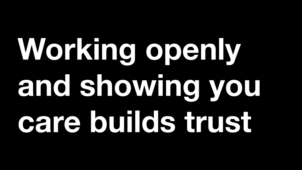
In the end, I think that working in the open and showing that you care builds trust.
It builds trust with users, your team and your stakeholders. It can help create the right environment for good to design to happen.
Thanks
Thanks!